01
A long measure and a serif, which is unusual for a clinic
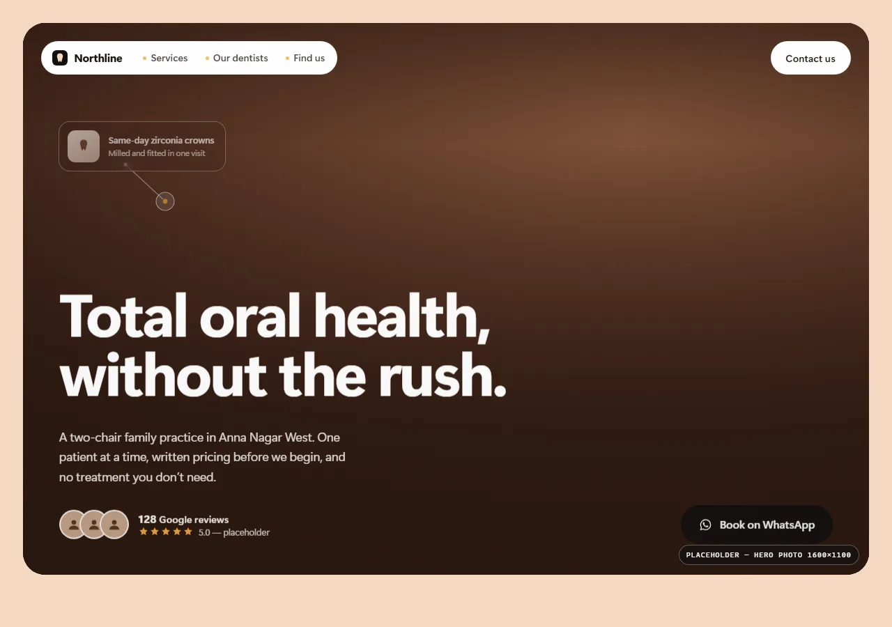
Clinic sites in Chennai almost universally use a sans-serif at short line lengths and a lot of blue. This build sets body copy in a serif at a genuine reading measure, which changes how the practice reads before a single word is processed. It is a positioning decision made in typography rather than in a tagline.
02
Treatment prices in a table, before the clinic photos
The four treatments people actually search for — root canal, implant, cleaning, braces — are priced in a plain table near the top. Patients who arrive worried about being upsold get their answer before they have to ask for it, which is worth more than a paragraph about patient-first care.
03
Credentials stated once, without inflation
Qualifications appear as a short factual line rather than a wall of logos and associations. A clinic that lists nine memberships reads as one that is compensating. One clear line of who the dentist is and where they trained does more.
04
No stock photography of foreign clinics
The layout is built to work with real photographs of a real clinic, including imperfect ones. Stock images of a Scandinavian dental suite are recognisable as stock to Indian patients and cost trust rather than building it.