01
The price list is the hero, not the photography
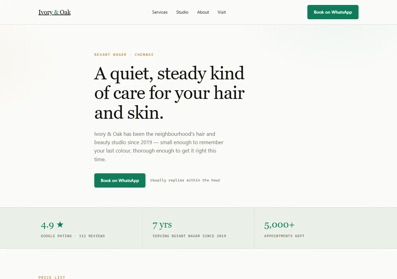
The service-and-price table sits directly under the opening line, above any image of the salon. This is the opposite of how salon sites are usually ordered, and it is based on what people actually do on the page: scan for a number, decide, then look at pictures to confirm the place is nice. Putting photography first serves the owner's pride rather than the customer's question.
02
Prices are stated, not 'starting from'
Every row carries a real figure. 'Starting from ₹500' reads as a trap and pushes the customer to call for a number they suspect will be higher. A stated price loses the customers who were never going to book at that rate, which is a feature — they were going to waste a phone call finding out.
03
One file, no framework, no font download
The entire site is a single HTML file with inline CSS. No external stylesheet, no web font fetched from another server, no JavaScript framework. The result transfers 7.5 KB compressed and starts painting in 0.15 seconds. A typical salon site in this market runs three to four megabytes.
04
WhatsApp instead of a booking form
A booking form asks a customer to fill in fields and trust that someone reads the inbox. A WhatsApp button opens a conversation they can see was delivered, in an app they already have open. For a salon taking ten bookings a day, the form is worse in every way that matters.